Main Branding Trends for 2015

branding, branding tips, branding trendsThere are all sorts of ways that brands will try to establish themselves in 2015, some of which will be a bit different, novel and even bring a bit of fun back into the equation. However, some ideas will undoubtedly establish themselves as trends, usually led by the innovative minds at top creative agencies and taken up by the most forward thinking of marketing executives. But what are the trends to look out for in 2015?

Honesty Around Big Data

One of the big trends of 2014 was big data capture. The brands that have it will possess a marketing edge over their competitors for years to come, so long as they use the data wisely to predict what it is the customer really wants. Customer retention is something will be easier for those who have made a significant investment in data capture, although 2015 is likely to see more openness from brands about how data is captured, how it’s stored and how it’s used. Any branding company should be recommending greater transparency in this area to allay customers’ fears over identity fraud and data security.

Greater Empathy

Brands certainly need to demonstrate an understanding of their clients’ needs, but only those who truly put themselves in their customers’ shoes will get to the heart of the matter. So often, empathy is reserved for post-sale customer service issues, largely when things go wrong. In 2015, empathy will be increasingly shifted to a pre-sale customer experience, so expect advertisements to focus on greater and more in-depth customer focused and understanding. For smaller brands this will be driven by their Youtube channels and online presence, but larger businesses will also focus on greater empathy in their above the line campaigns; TV, press and outdoor marketing activities.

Brand Empowerment

This year, many brands will throw over their identity to their customers and clients in a way that we’ve never seen before. From crowd sourcing to logo interpretation and social media engagement, empowering stakeholders, rather than shareholders, will be what it is all about in the next twelve months. The idea is that corporate identity will be increasingly humanised and, for the most successful brands, this will lead to a personalisation of the relationship between brand and consumer. Empowerment will be the byword for any brand that wants to be a ‘friend’ of its customers.

What Are The Best Colours For Online Conversions?

In the global world of online commerce, design is a language in its own right. From guiding the flow of web traffic, to highlighting and emphasising products, services, and options, how you look is increasingly an influence on how you sell. And, in the digital realm, colour is a key component of this unwritten language.

Unlike the written word, the vocabulary of colour is a more complex language to translate. Our interpretations of colours are infused with cultural contexts and learned responses. So is colour really a universal language?color theory

Colour Theory and Culture

Colour is linked with memory and association. Our responses are often ingrained through learning, rather than inherent traits, although this learning can itself come from nature. Green is healthy; blue is peaceful. Red is seen as vibrant, but also urgent: which is why it is so widely used for discount sale signs in shops, and also warning signs.

Colour in commerce can affect our assumptions too: we see blue and teal as signs of dependability and honesty, and these are the colours most commonly associated with banking brands. But do we see blue in this way because it is used by banks? Equally, certain brands have made the colour orange synonymous with dependability and value for money, yet in some communities, orange is also a divisive emblem of political loyalties.

So the challenge for any design agency with an eye on web-based commerce is this: when you sell online, you sell to the whole world. How can you strike a compromise between the many differing interpretations of your brand’s colour palette?

The Psychology of the Perfect Palette

Using colour to focus the eye and influence navigation is one matter. But when it comes to converting mouse clicks into cash, this is where colour theory really becomes interesting. Because there are clear examples where colour most definitely is a universal language.

This is where an understanding of colour palettes can really be converted into profit. A good digital design agency will know how to use colour to direct attention; a great one will know how to create a meaning. A fantastic case study to illustrate this is the re-branding of McDonald’s restaurants, from red to green. The company faced criticism for being too aggressive in its business practices, and that their products had become unhealthy. Out went the domineering and dangerous red; in came the calm and natural deep green. The company reversed a downward trend and the strategy is considered one of the most successful top tier re-brandings of recent years.

So, which colours are best for online conversion? That all depends on your objectives. And – as with all matters of colour – context is king. One interesting question to ask of your palette is this: will your colours be a prompt, or a problem solver? In the example given above, the brand used colour to address a perceived problem with their image. In doing so, they relied on the broadest, most universal interpretations of very bold colours. If your brand is strong, but you are routinely failing to complete sales due to an indistinct layout, colour can be a prompt: bold and urgent contrast hues that direct the customer’s eye towards completing the purchase. So whether you are building a brand identity, or simply improving your end-user experience, think about how you can be communicating in colour.

Image Credit: http://www.1stwebdesigner.com

Top Web Design Trends For 2015

design trends 2015

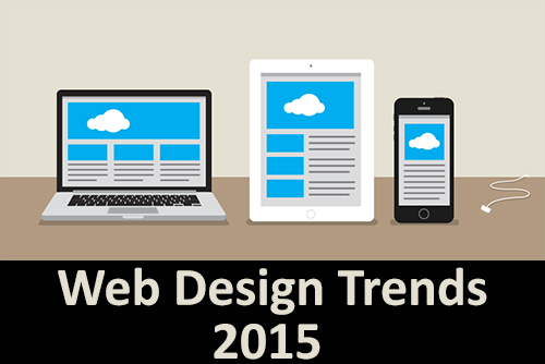
As any web design company worth its salt knows, design trends can vary widely from year to year. 2014 saw a lot of focus placed on mobile technologies, with designers everywhere seeking new and better ways to optimise their sites for use on mobile and tablet devices; other trends included flat design, minimalist navigation and an increase in video and moving backgrounds.

So, what new trends and innovations do we anticipate in the year ahead? In this article we highlight 7 features that you can expect to see featuring on a website near you.

Video content

There’s been a recent upsurge in sites using video to promote their services; from infomercials to product demonstrations, websites are increasingly offering visual content to captivate their visitors. With many people switching to fibre optic broadband and faster online services, now is the time to deliver engaging video content.

Hidden navigation

By de-cluttering the screen, designers can maximise space to deliver content. Navigation menus that slide in or are activated by a roll-over or click are making a return to websites, particularly on the mobile viewport where space is at a premium.

Ghost buttons

Ghost Buttons are have certainly become more popular recently, subtle links to pages that blend into the overall page design. Often just a simple transparent shape with no fill and just a keyline — hence the name — these links help to create a more minimalist design. The style is quite popular on visual websites that make use of full-screen photography.

Parallax scrolling

The parallax effect has been around for sometime now, but it has become more popular in web design recently. Web designers are using the effect in scrolling sites to introduce a sense of depth and and create 3D effects. It can be an effective way of driving users through a narrative or storyline on visiting your site. Definitely a trend that’s set to continue in 2015.

Designs for larger screens

If 2014 was the year of mobile websites, could 2015 be the year of the big screen? With web0-ready TVs becoming more prevalent, designers are having to consider people surfing the web on large TVs or projector screens? Designing for the larger screen requires a different approach, which is sure to become more widespread in the years ahead.

Dynamic content

Imagine being able to deliver unique content that’s relevant to individual visitors. Dynamic content can be really powerful and engaging, as long as you have accurate information about your audience. Being able to deliver content in this manner is the future of the web, which could have a tremendous effect on conversation rates.

Colour co-ordination

Brands can certainly benefit from our emotional response to colour. Your branding consultancy can help to establish a colour palette, or perhaps theme your site around an existing identity. Whether you go for neutral tones with an accent colour, or a rainbow of colour, it’s important to get it right.

As 2015 unfolds, it’s going to be interesting to see which of these trends become common practice and which ones are phased-out by new ideas or advances in web technology.

Top tips to improve your brand on-line

branding, how to build brand onlineThe majority of businesses have an online presence that allows potential customers to interact with the brand in some way; the most successful ones certainly do. To stand out from the competition, you must embrace all the tools at your disposal. When you approach a brand consultancy to help raise your profile, there are some key points they will consider.

Celebrate achievements

Highlighting your awards or accolades gives people confidence and adds credibility to your communications. If you’ve been praised for customer service, innovation or quality, it’s always worth shouting about.

Customer satisfaction

Potential customers want to know that your former customers have been satisfied with your service. This can be achieved through customer testimonials, as well as by allowing users to review and rate their customer experience.

Free content

Place additional resources at your visitors’ disposal to give them more reason to return to your site, making it more likely that they’ll use your services. Resources to consider might include downloadable information, document templates or links to other resources.

Plain speech

It’s important to ensure you communicate your proposition in a clear fashion; try to avoid jargon or technical terminology that might be a barrier to some. A website shouldn’t be used as an opportunity to demonstrate how many of your industry’s buzzwords you know, but rather as a place for you to demonstrate what you can do for your customers.

Social media stats

Social media channels can be really effective communication tools. Including links to your social media accounts can encourage engagement through a number of different platforms. It’s important to be smart with social media tools, they need to be used productively — there’s no point in having a Twitter account that’s inactive.

If your business works with a digital agency, it is important to consider all of the points above. Having a clear understanding of the essential tools for brand communication will give you the confidence to engage with an agency that can help you to achieve your vision.

5 Elements of Web User Interface Design Best Practice

ui design, design servicesWhen a user visits a website, certain elements will make them feel comfortable about using it. Potential customers will make a judgement about your website within seconds, so your chosen website design company will follow a number of key rules to optimise the user experience.

Clarity

All elements of the user interface should be clear and intuitive. If the user is unsure what to expect from any of them, such as a misleading or obscure icon, they may not have the confidence to click — they’re more likely to move onto another site, that has an interface that seems more familiar or easier to navigate.

Action

The user needs to be guided toward the action you would prefer them to take. For example, if that action is to provide some information then the text field in which you would like them to type needs to be clearly labelled. It sounds obvious, but explaining exactly what’s required from the user will only improve the overall user experience.

Guidance

In much the same vein, a direct invitation to do something is likely to yield greater results than simply presenting the opportunity. If you would like the user to enter their comments, a simple instruction such as ‘Enter your message here.’ will encourage that action.

Context

An important part of the web designer’s role is to ensure that user interface elements are clear; any functionality should always be intuitive and obvious to the user. For example, placing controls close to the element they affect makes good design sense.

Feedback

If the interface provides feedback on interactions, the user will feel confident they’ve achieved the desired outcome. An example of this might be a message such as ‘Your email has been sent’; this provides clear confirmation and the user can continue.

These five steps are vital elements in user interface design. An agency offering professional design services should adhere to these principles in order to provide you with the best solution, allowing you to do the same for your own customers.